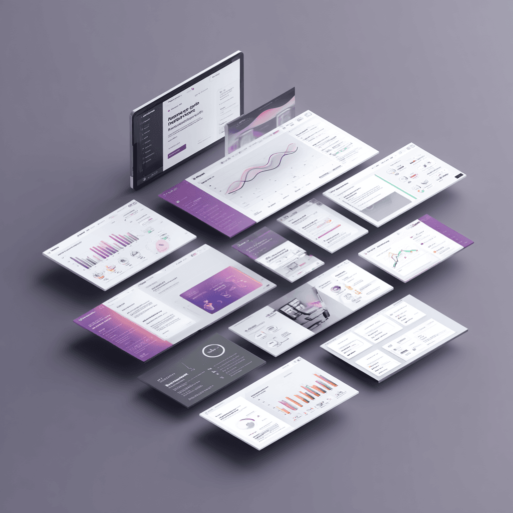
Before a visitor reads a headline or considers a CTA, they have already formed an impression. Premium websites shape that impression deliberately, using structure and restraint rather than volume and decoration.
People do not read a website before they trust it. They feel it first. Within seconds of arriving, a visitor has already formed a working opinion about whether the business behind the page is serious, capable, and worth their time. That opinion shapes every interaction that follows — whether they keep reading, whether they fill in a form, whether they return.
Premium websites build trust faster not because they spend more on design, but because they make fewer decisions that produce hesitation. Understanding how premium websites build trust faster is largely an exercise in removing the things that create doubt, rather than adding things intended to impress. The gap between a site that converts and one that does not is usually not the quality of the copywriting or the size of the portfolio. It is whether the page communicates competence before any of that content has a chance to land.
What visitors notice before they read
Research on visual processing consistently shows that aesthetic judgment happens faster than conscious reading. Visitors form layout impressions in under 100 milliseconds — far faster than they can absorb meaning from text.
In practice, this means several things matter before a single word is read:
Whether the page feels spacious or crowded
Whether the hierarchy makes it immediately clear what to focus on
Whether the overall color logic feels thought-through or inconsistent
Whether imagery feels professional and considered, or generic and stock-heavy
None of these are about luxury. They are about legibility — specifically, whether the business looks like it made deliberate decisions rather than default ones.
The role of restraint in credibility
Most businesses add things to their websites when they want more results. More sections, more proof, more badges, more animation. The instinct is understandable, but it usually works against the goal.
Cramped pages force visitors to work. When every inch carries a competing signal — a testimonial here, a badge there, a CTA in three places — the visitor cannot form a clean impression of what the business actually stands for. The effort required to parse a noisy page reads as a lack of confidence, not as thoroughness.
Premium websites produce a different effect precisely because they hold back more than they show. Generous whitespace lets the eye rest. A single strong CTA creates clarity instead of confusion. Typography that stays consistent feels intentional rather than assembled from parts.
“The most confident websites remove friction. The least confident ones fill every gap with reassurance.”
MediaPanda perspective
This is not about minimal aesthetics as a style choice. It is about understanding that a calm page performs a function: it tells the visitor that the business knows what it is doing. That signal arrives before any explicit proof does. It is one of the clearest patterns in how premium websites build trust faster than their noisier counterparts.
Why hierarchy shapes commercial confidence
Hierarchy is how a page tells visitors what to look at and in what order. When hierarchy is weak, visitors scan without a clear path, which means the most valuable content competes with lower-priority content for attention it will not reliably earn.
Strong hierarchy in a premium website context usually means:
A headline that earns attention without explaining everything
A supporting line that answers the most immediate question the headline raises
A primary CTA that is visually distinct from everything else on the first screen
Proof or credentials placed after orientation, not before
The order matters because it reflects an understanding of how visitors think. Someone who just arrived at your site is not yet ready to evaluate your credentials. They need to understand what you do, and for whom, before they will apply judgment to your proof points.
Showing a long list of client logos before the visitor knows what the business does is a common hierarchy error. It signals that the site was assembled for the business owner's approval rather than for the visitor's decision process.
How copy density signals capability
Two websites can contain the same information and produce very different trust levels based entirely on how much they put on each screen.
Dense copy reads as compensating. When a business writes long, overlapping paragraphs to explain a simple offer, visitors often interpret that as a sign that the offer itself is unclear — or that the business is not confident enough to be direct.
Short, structured copy reads as capable. When a page makes its point in a few well-chosen sentences and then stops, visitors assume the business knows who it is for and does not need to convince everyone. That certainty is itself a trust signal.
This does not mean the website should be sparse everywhere. Long-form content earns its place when visitors have decided they want depth. The key is that depth comes after trust is already forming, not before.
Specific signals visitors use to evaluate credibility
Beyond layout and copy, visitors rely on a handful of signals that function as trust shortcuts. Understanding which ones matter most helps in prioritizing where to invest attention.
Photography and imagery quality: Stock photography that reads as generic undermines credibility regardless of how good the copy is. Visitors notice when imagery does not match the business — either in style, specificity, or tone. Custom photography or editorially chosen imagery signals that the business treats its presentation as a reflection of its standards.
Consistency between sections: A premium website does not change its tone, spacing logic, or visual style between sections. Inconsistency across a single page implies the site was built piecemeal, without a strong editorial or design hand. Even subtle shifts in font treatment or padding create a subliminal sense of improvisation.
Page speed and responsiveness: A slow or broken-loading page is an immediate trust failure, regardless of the visual quality it eventually reveals. Visitors who encounter lag on arrival rarely wait to judge whether the rest of the experience is better.
Copy that addresses real concerns: Trust is also shaped by whether the business seems to understand its visitors. Copy that addresses the specific hesitations a buyer has — rather than generic benefits — signals that the business knows its audience.
Pages that are built around visitor decision logic earn trust faster than pages built around the business's preferred narrative.
What a trust audit looks like in practice
If you want to understand where your current site is producing hesitation, the most useful exercise is to load it as a stranger would.
Open the page on a device you do not use for development. Give it three seconds. Then ask: what is the first thing you noticed? What does the business do? What are you supposed to do next? If those answers take effort to form, the page is producing doubt somewhere that structure or copy can address.
A more direct method is to watch session recordings of real visitors. The places where people scroll back up, pause for an extended time, or hover without clicking are usually the places where the page failed to give them what they needed in the order they needed it.
The goal is not a perfect website. It is a website that handles the first thirty seconds well enough that visitors give the rest of the page a chance.
FAQ
Does visual trust apply for businesses that sell services, not products?
Yes — often more so. Service businesses do not have a concrete product to evaluate, which means the website experience itself becomes a proxy for the quality of the engagement. Visitors ask themselves: do these people seem careful? Do they seem to understand what I need? Website structure answers both questions before a proposal or call has even happened.
Is this only relevant for premium-positioned brands?
No. Any business that wants to earn visitor confidence benefits from these principles. The term "premium" here refers to the thoughtfulness of execution, not the price point of the offer. A healthcare clinic, a boutique agency, or a professional services firm all benefit from the same logic: reduce hesitation, create clarity, and let the strongest ideas lead.
Can a small business implement these changes without a full redesign?
Yes. Many of the most effective changes are editorial rather than structural — tightening copy, improving hierarchy on the first screen, removing elements that compete for attention without earning it, and replacing generic imagery with something more specific. These often require less time than a redesign and produce measurable improvement in visitor behavior.
How long does it take to see results from trust-focused improvements?
Results depend on traffic volume and the size of the changes, but businesses that make focused trust-signal improvements — particularly on landing pages or the homepage — typically see shifts in session depth, bounce rate, and form completion rates within a few weeks of meaningful traffic.
---
Trust is not communicated through volume. It is communicated through the sense that someone with good judgment made deliberate choices about what to show, what to remove, and what to make clear. That is precisely how premium websites build trust faster than competitors with more content and more noise: they make confidence legible from the first screen.
That is what premium websites do — and it is why they convert at a different level than ones that leave those decisions to chance.
If your current site is not performing the way the business deserves, the first question worth asking is not "what should we add" but "where are we creating doubt." The answer is usually in the same three places: structure, clarity, and restraint.
MediaPanda helps businesses build premium websites, multilingual content systems, and digital strategies that support organic growth and AI-era visibility.
Keep reading
Related articles
A few adjacent reads from the same archive, chosen by shared themes and category overlap.
A polished website is not the same as an effective one. Many business sites look professional but quietly fail to convert visitors into real business website enquiries.
AI Mode website visibility is the new challenge for businesses. Google is replacing search results with AI conversations, and most company websites are not built to survive that shift.